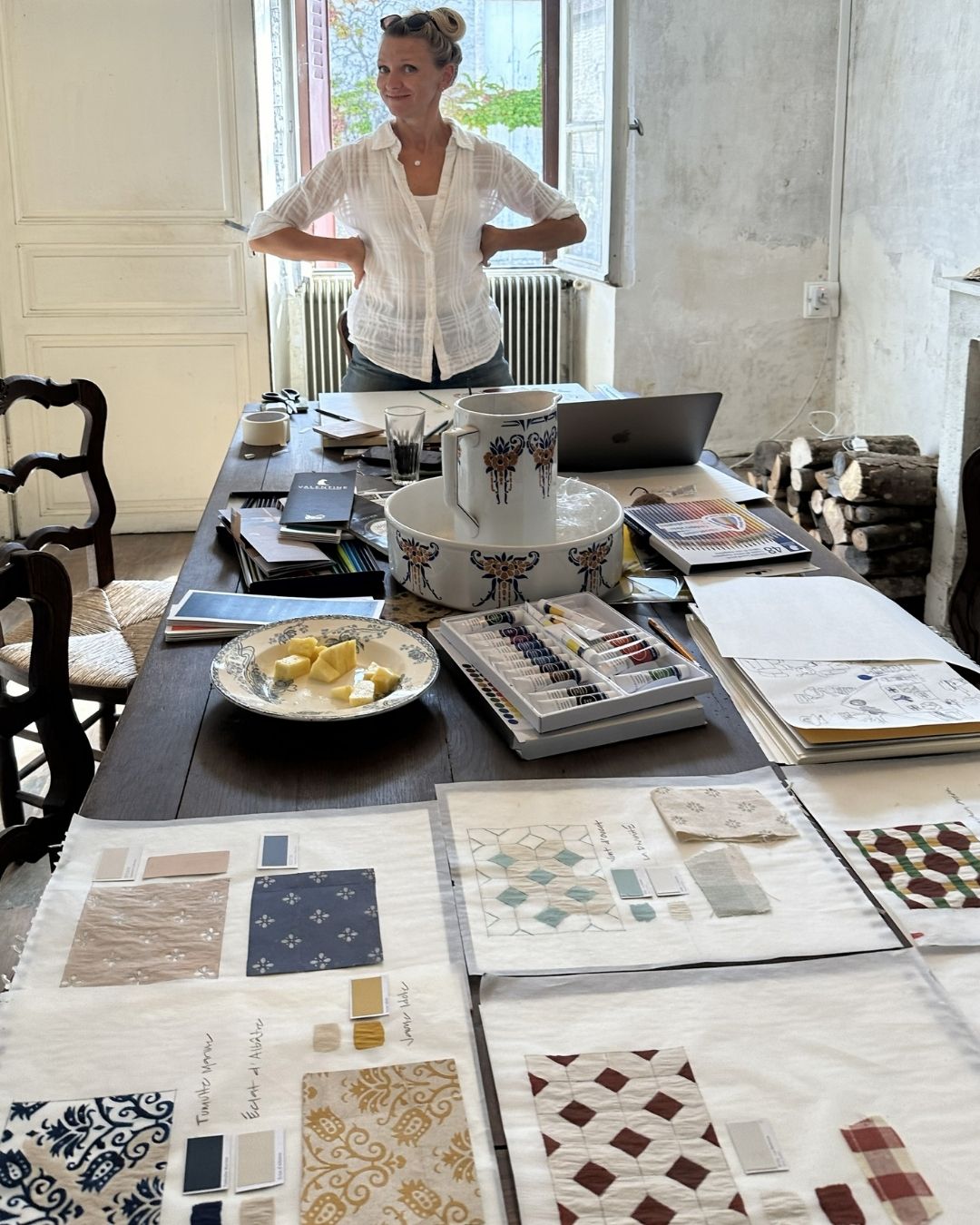
Tile has long been valued for its ability to bring personality, texture, and artistry into a space. While many people focus on color, shape, or pattern when selecting tile, the manufacturing process plays an equally important role in the finished product. Among the most admired options are hand poured tiles and hand painted tiles. Both represent a level of craftsmanship that machine-made products often struggle to replicate, yet they achieve their beauty in very different ways.
Understanding what sets hand poured and hand painted tiles apart can help designers, homeowners, and architects choose the right material for their projects. From how the tiles are created to the visual impact they produce, each approach offers unique characteristics that influence the overall look and feel of a space.
What Sets Them Apart
When comparing artisan tile options, the first thing to understand is that hand poured and hand painted tiles are created through entirely different processes. Although both involve skilled craftspeople and result in products with distinctive character, their methods of production shape everything from appearance to texture.
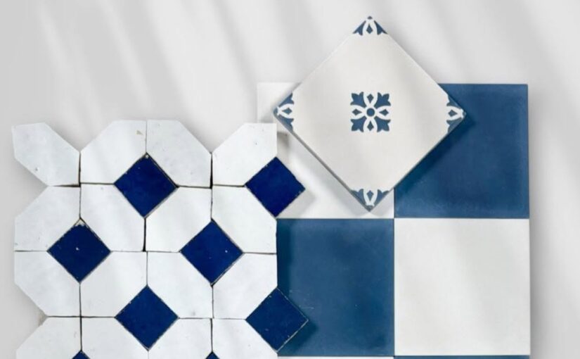
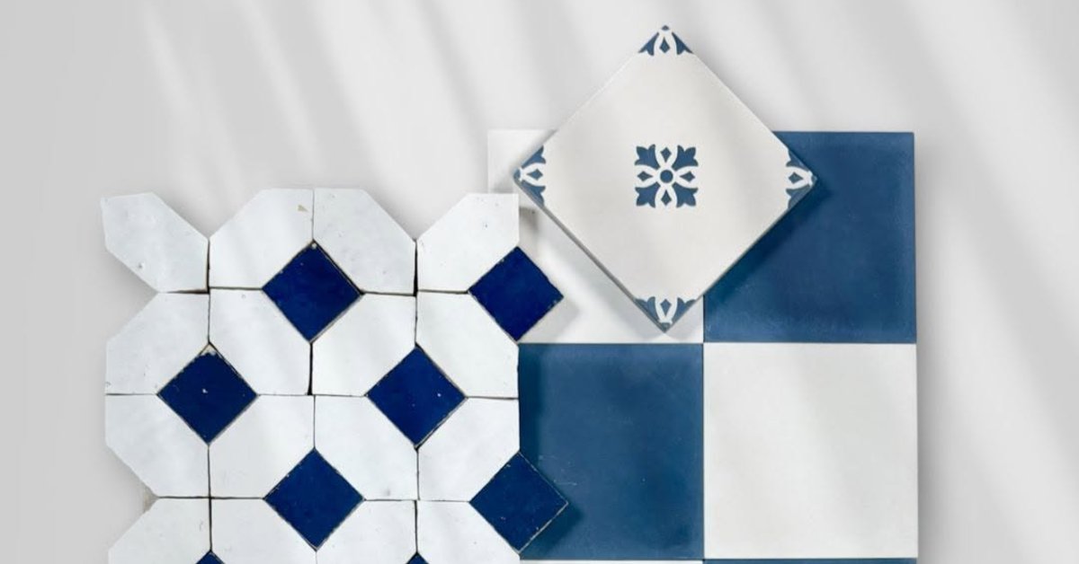
Hand poured tiles derive their patterns and colors during the manufacturing process itself. Pigmented materials are carefully poured into molds, allowing the design to become an integral part of the tile. Hand painted tiles, on the other hand, receive their decorative elements after the tile body has already been formed. Artisans apply patterns, illustrations, or color treatments directly onto the surface using brushes and specialized techniques.
These differences affect durability, variation, artistic expression, and the overall aesthetic of the finished installation.
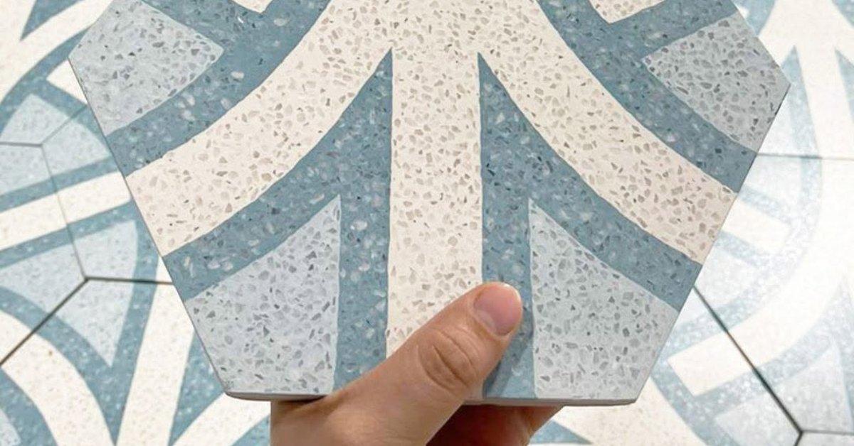
The Craftsmanship Behind Hand Poured Tiles
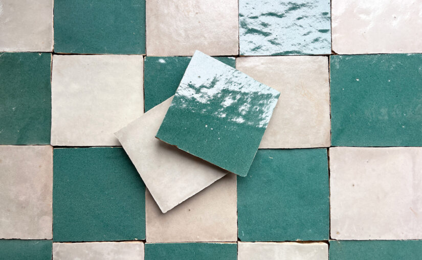
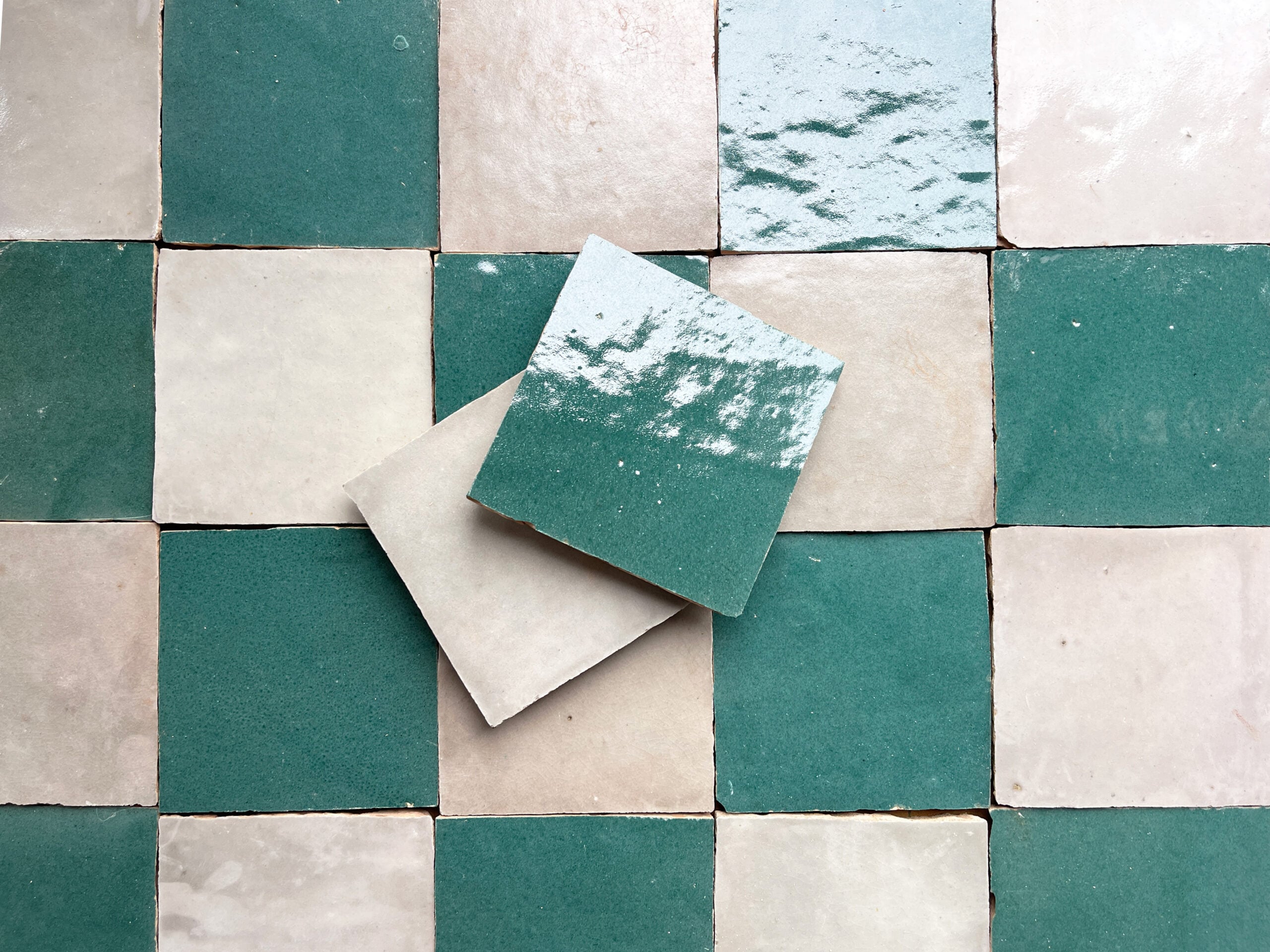
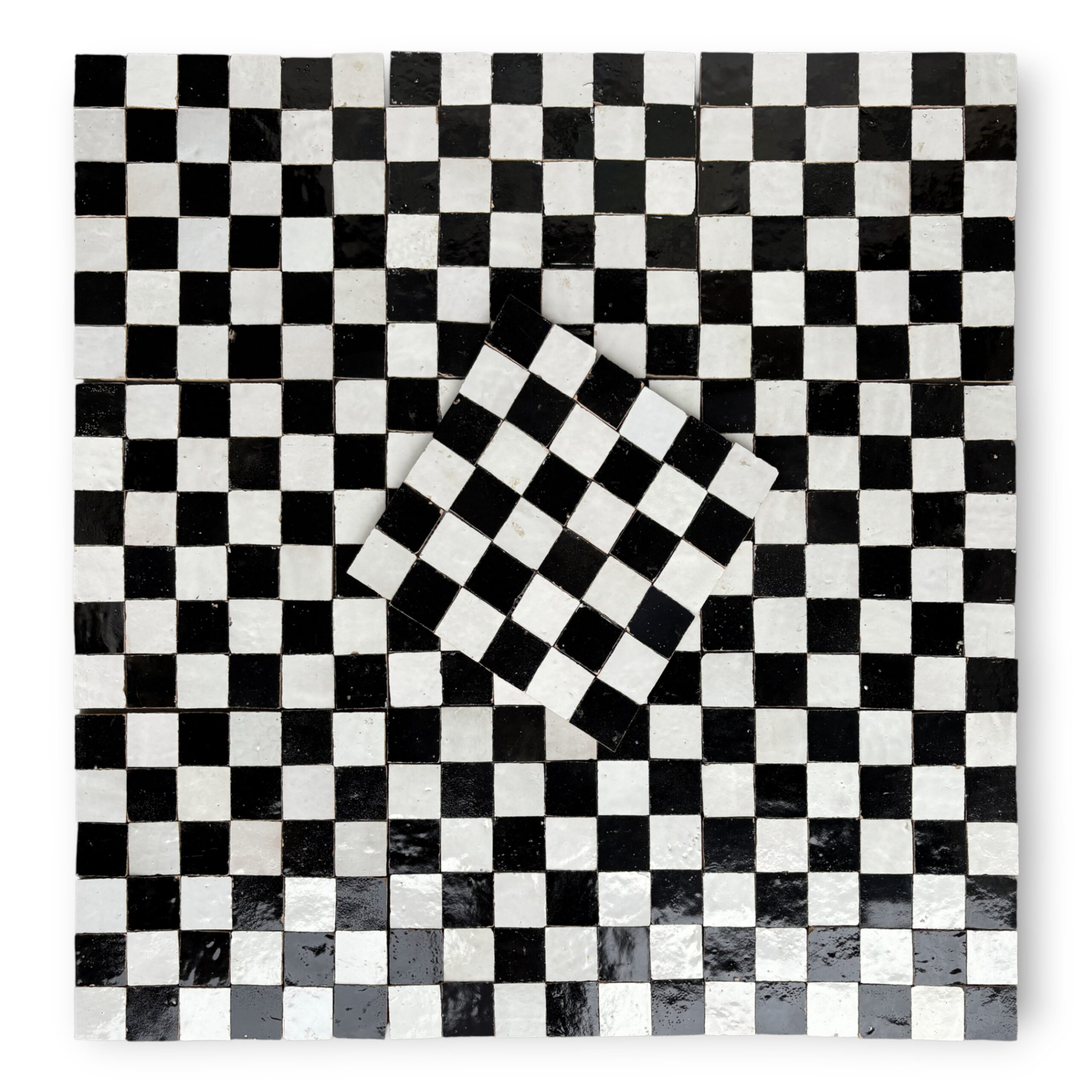
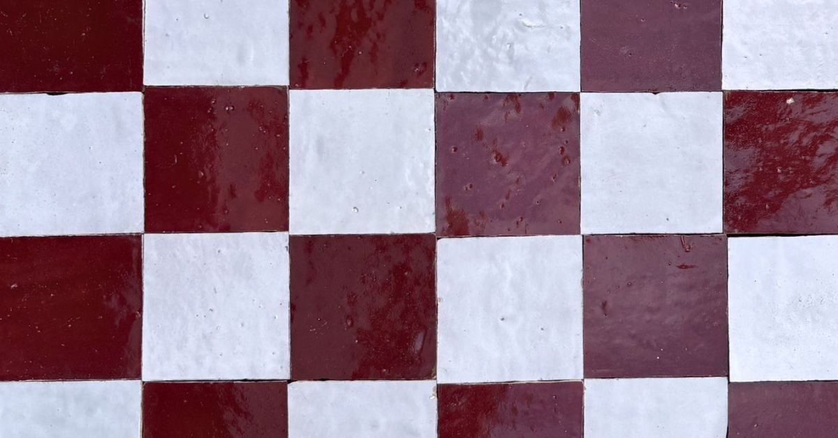
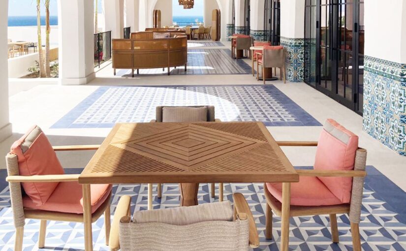
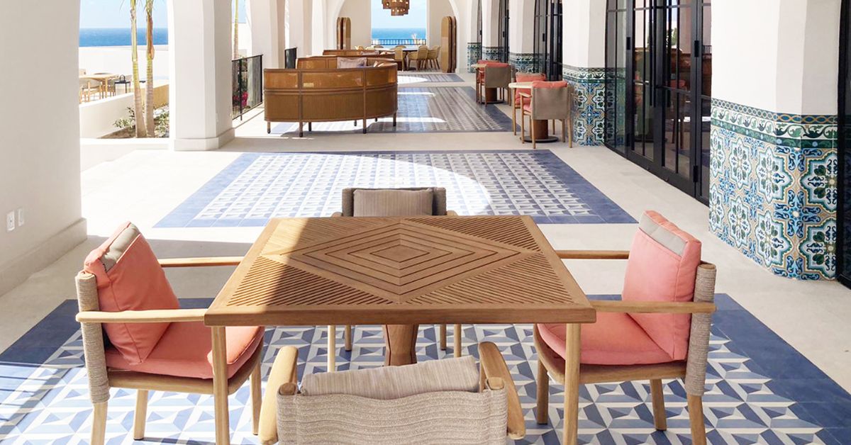
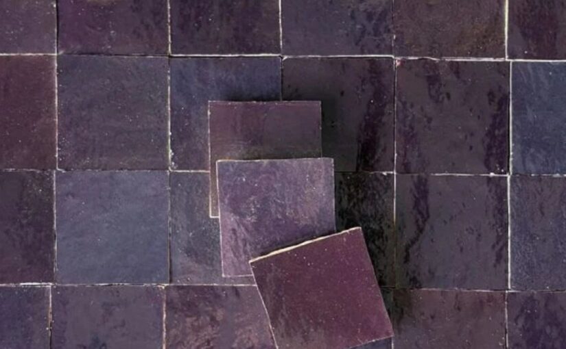
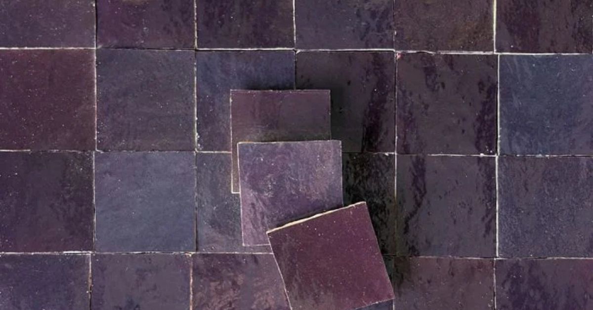
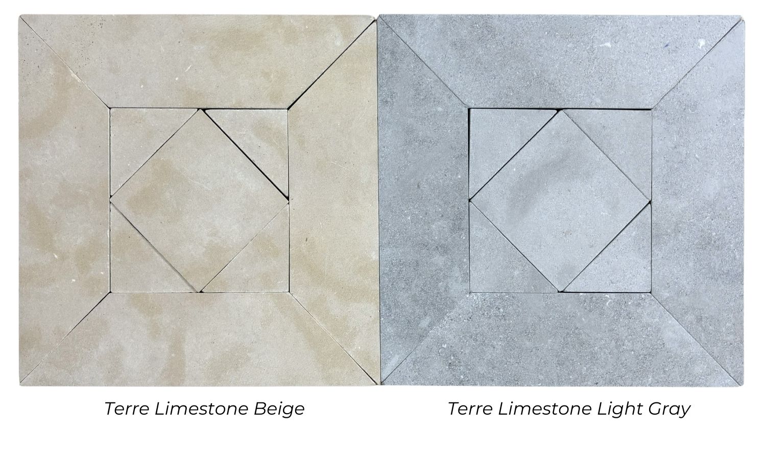
Hand poured tiles are often associated with traditional cement tile manufacturing. Skilled artisans use molds to separate colors and create intricate designs. Pigmented cement mixtures are poured into specific sections of the mold, forming the pattern layer before the tile is compressed and cured.
Because the design is embedded into the surface rather than applied afterward, the pattern becomes part of the tile itself. This process allows the color and design to remain consistent even as the tile ages. The result is a product known for its durability and rich visual depth.
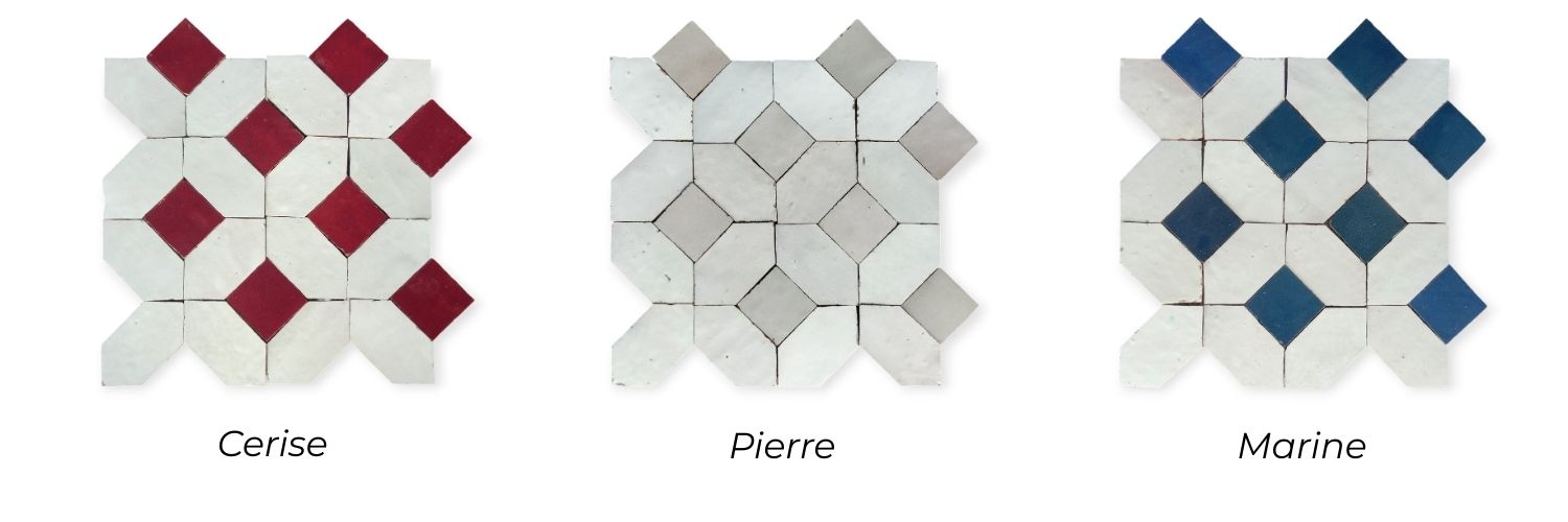
Each tile is individually crafted, which naturally introduces subtle variations. These differences are often celebrated because they give installations a sense of authenticity and warmth that cannot be duplicated through mass production.
Many designers appreciate handmade cement tiles because they combine old-world craftsmanship with long-lasting performance. The slight differences from tile to tile contribute to a surface that feels alive and full of character.
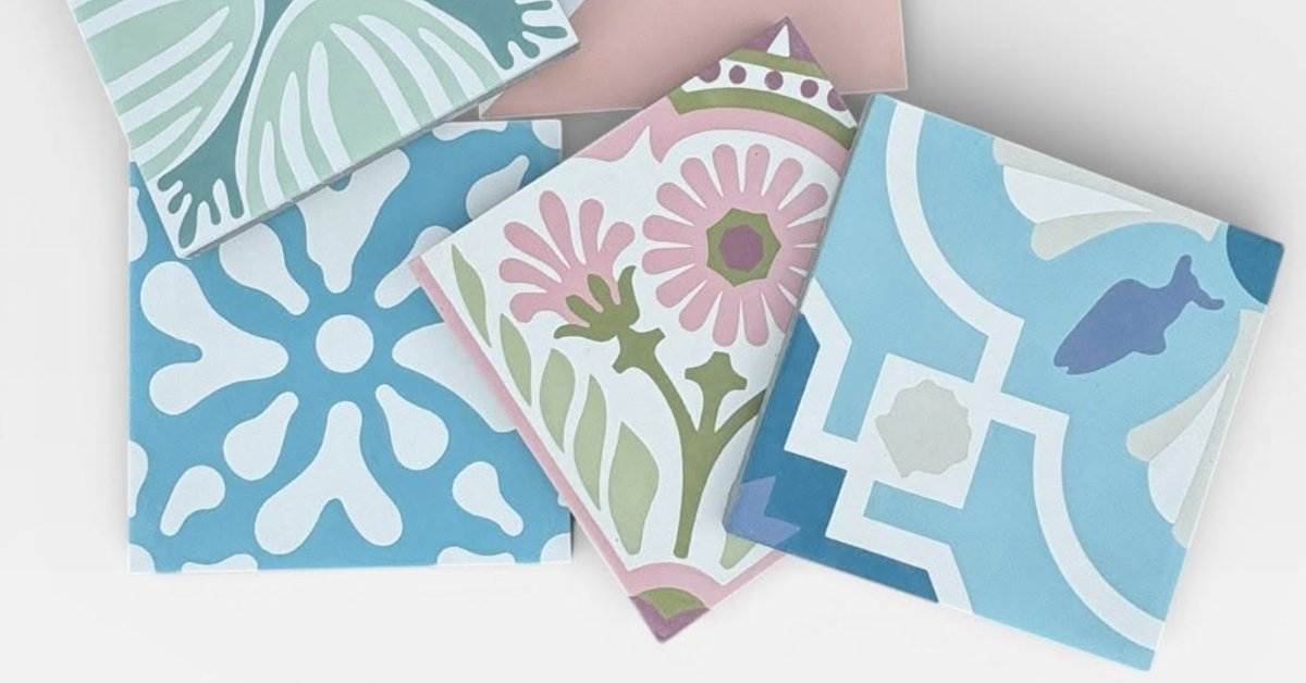
The Artistry of Hand Painted Tiles
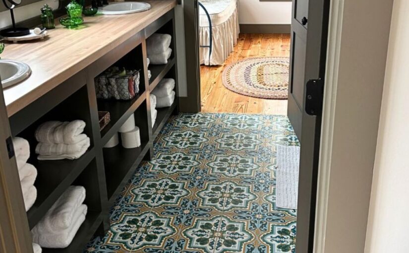
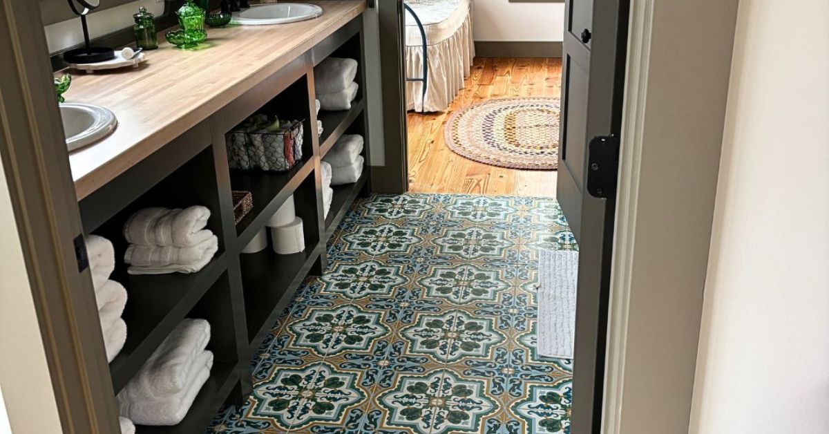
Hand painted tiles take a different path to achieving their beauty. Once the tile body has been formed and prepared, artisans apply decorative elements directly onto the surface. Depending on the style, this may involve detailed illustrations, geometric motifs, floral patterns, or custom artwork.
Every brushstroke reflects the skill and creativity of the artist. Unlike hand poured tiles, where patterns are guided by molds, hand painted tiles allow for nearly unlimited artistic freedom. This makes them especially popular for accent walls, decorative borders, backsplashes, and feature installations.
The hand painting process often produces slight inconsistencies that enhance the tile’s charm. Variations in brush pressure, paint application, and detailing ensure that no two tiles are completely identical. These subtle distinctions create a sense of movement and personality that many designers find appealing.
Because the decoration is applied by hand, hand painted tiles often feel more expressive and individualized than other tile styles.
Differences in Visual Appearance
One of the most noticeable distinctions between hand poured and hand painted tiles is their overall visual effect.
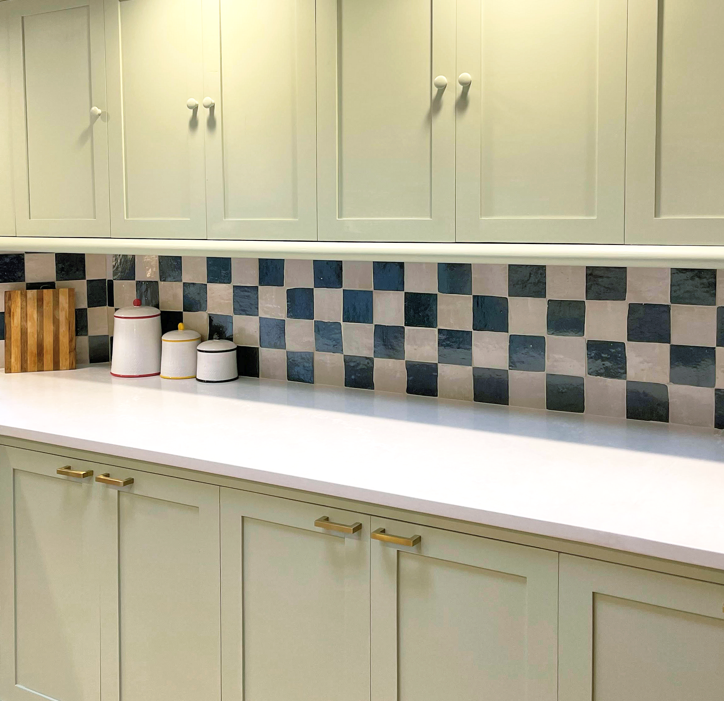
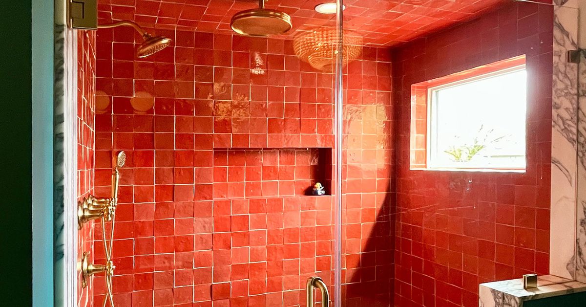
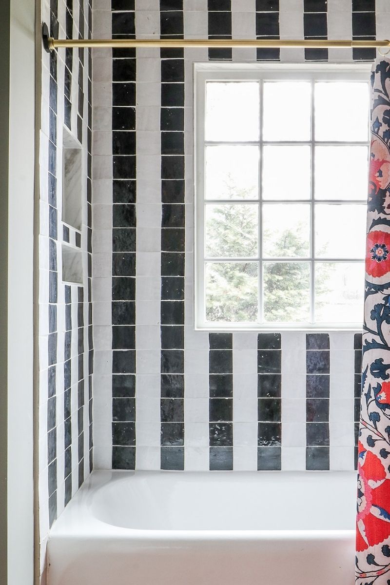
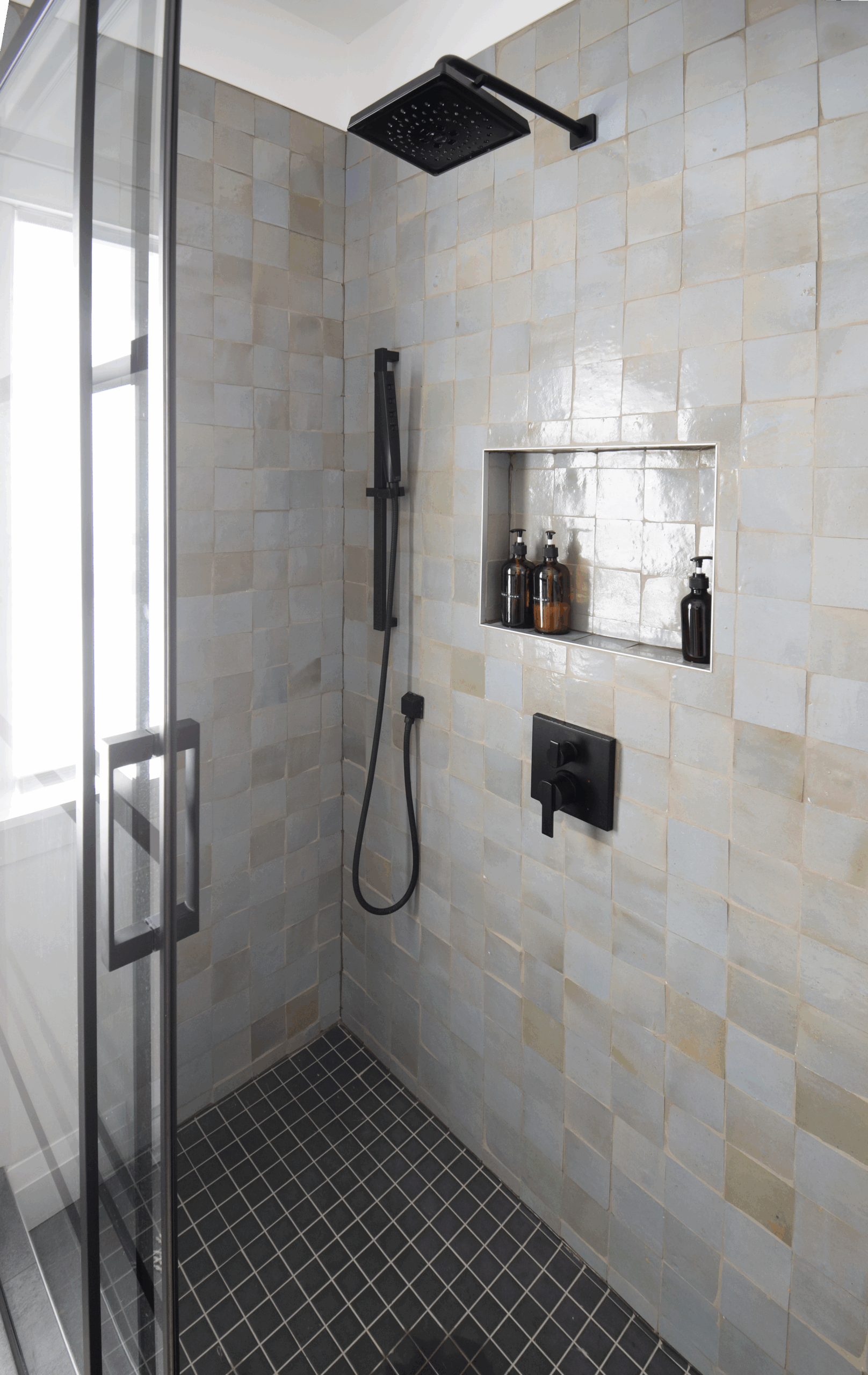
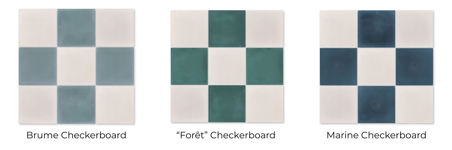
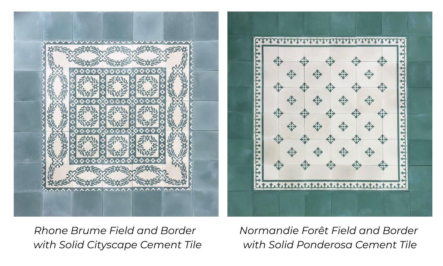
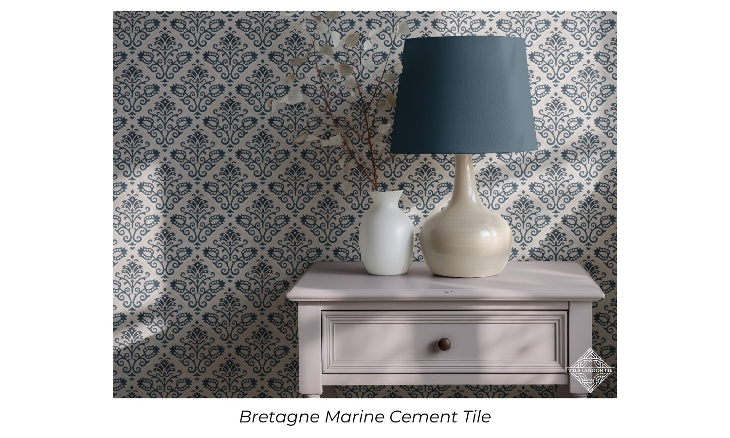
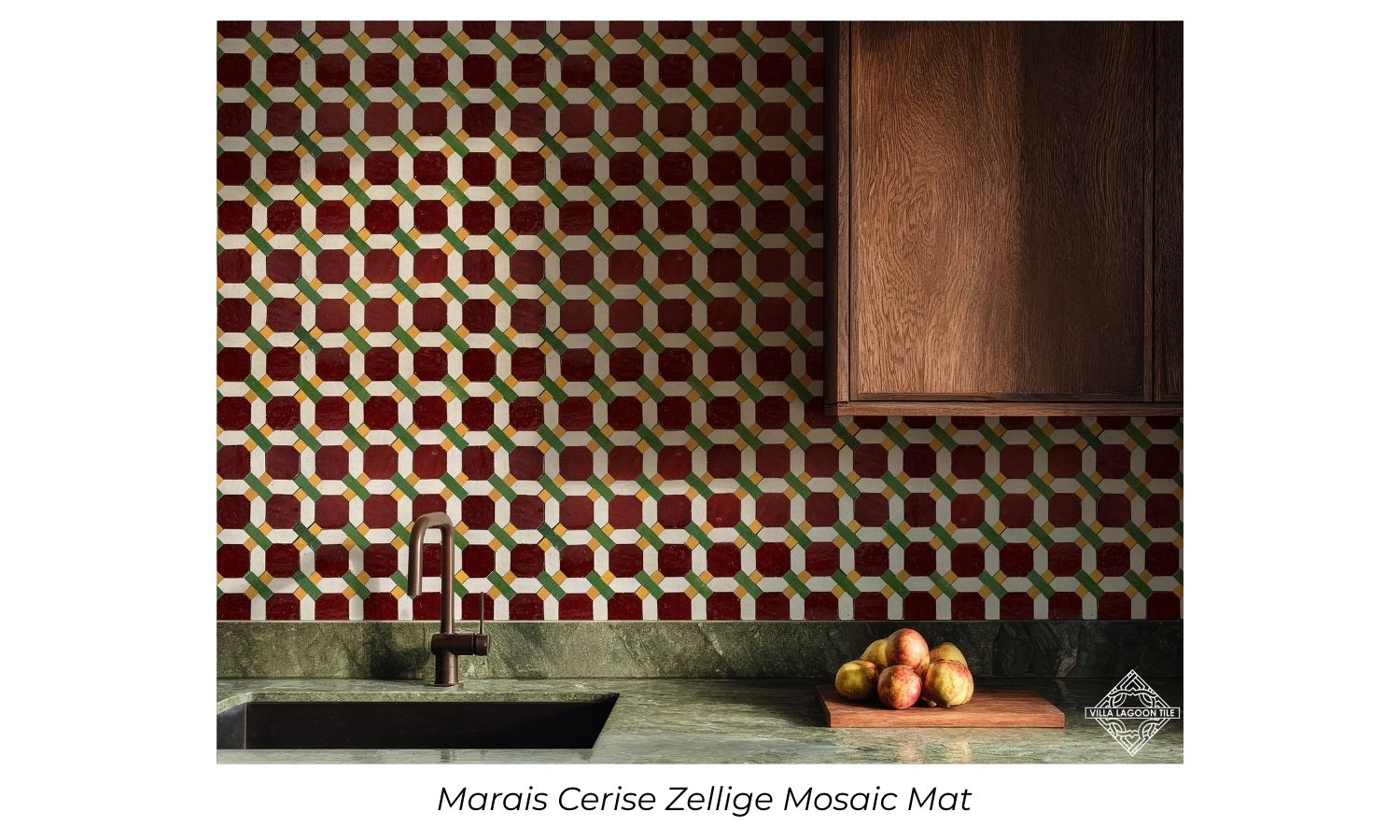
Hand poured tiles typically feature crisp, defined patterns that are built directly into the tile. Colors often appear rich and saturated, while the surface maintains a consistent appearance across larger installations. The embedded design creates depth without relying on painted details, making these tiles particularly effective for floors and expansive wall applications.
Hand painted tiles tend to have a softer, more artistic appearance. Brushstrokes can create subtle texture, and minor variations in color intensity contribute to a handcrafted aesthetic. Rather than emphasizing perfect repetition, hand painted designs celebrate individuality and artistic interpretation.
The choice between the two often comes down to the desired atmosphere. Hand poured tiles frequently complement structured, geometric, or patterned designs, while hand painted tiles bring a more decorative and expressive quality to a room.
Durability and Long-Term Performance
Durability is another important consideration when selecting between these tile styles.
Because the decorative layer of a hand poured tile is integrated into the material itself, the design remains an inherent part of the tile. This characteristic has helped make hand poured cement tiles a popular choice for high-traffic areas. With proper maintenance, they can retain their visual appeal for many years.
Hand painted tiles are also durable, particularly when protected by high-quality glazes and firing processes. However, their decorative elements exist on the surface rather than within the body of the tile. As a result, they are often chosen for walls, backsplashes, and areas where artistic presentation takes precedence over heavy wear resistance.
Both options can perform exceptionally well when used in appropriate applications and maintained according to manufacturer recommendations.
Design Flexibility and Customization
Customization is an area where both styles excel, though they offer different advantages.
Hand poured tiles provide remarkable flexibility when it comes to color combinations and repeating patterns. Designers can select from a wide range of geometric motifs, floral arrangements, and historic-inspired designs. The precision of the mold-based process allows complex patterns to flow seamlessly across large surfaces.
Hand painted tiles offer nearly limitless creative possibilities. Artists can produce custom imagery, intricate murals, personalized motifs, and one-of-a-kind decorative elements. This makes them especially appealing for projects seeking a distinctive focal point.
When clients desire a highly customized artistic statement, hand painted tiles often provide the greatest creative freedom. When a project calls for a consistent pattern with handcrafted appeal, hand poured tiles frequently become the preferred choice.
How Each Style Influences Interior Design
The type of tile selected can significantly influence the overall character of a space.
Hand poured tiles often create a sense of structure and rhythm. Their repeating patterns can establish visual continuity across floors, walls, patios, and commercial environments. They work particularly well in Mediterranean, Spanish Revival, modern, and eclectic interiors where bold pattern plays a central role.
Hand painted tiles introduce a more decorative and artistic element. Whether used as a kitchen backsplash, bathroom feature wall, or fireplace surround, they naturally draw attention and create visual interest. Their handcrafted appearance can soften contemporary spaces while adding authenticity to traditional interiors.
Designers frequently use hand painted tiles as accents and hand poured tiles as foundational design elements, though both can serve either purpose depending on the project goals.
Choose the Right Tiles
Hand poured and hand painted tiles each offer a unique blend of artistry, heritage, and craftsmanship. While hand poured tiles embed their beauty directly into the material through carefully controlled production methods, hand painted tiles showcase the individual touch of skilled artists through surface decoration.
For designers and homeowners seeking authentic materials with character, both options provide compelling advantages. The decision ultimately comes down to the desired aesthetic, the intended application, and the type of visual story the space is meant to tell.
By understanding what sets hand poured and hand painted tiles apart, it becomes easier to appreciate the craftsmanship behind each style and choose the one that best supports a project’s design goals.